
An Interview with Eric Siry, Creative Director for REALITYRx
We sat down with our Creative Director, Eric Siry, to talk about infographics, which are vitally important in medical communications today. Eric has been an infographics and graphic-design trailblazer as art director and design director for such magazines as Rolling Stone, Wired, Bon Appétit, Business 2.0, Ode and Working Mother and for such agencies as Ogilvy CommonHealth Worldwide and—since 2018—REALITYRx.
RRx: Before we get into “infoporn,” talk to us about infographics and the modern-day icon of infographics, pardon the pun, Edward Tufte, a statistician, artist and author of numerous books, including the landmark 1983 work, The Visual Display of Quantitative Information.
Siry: Tufte’s goal was to provide a detailed study of how to display data for precise, effective, quick analysis.
I think that’s an important bit of context because infoporn turns that on its head; by comparison it’s very imprecise but aims to be effective in a different way. Tufte says we should use the minimum amount of ink required to convey information, and that anything else is just unnecessary “chart junk.”
It’s like how to be as parsimonious as possible in conveying information effectively. Infoporn is all about going over the top to try to convey excitement, however, in the process, it can overshadow the data.
Tufte preaches that the information itself is or should be exciting enough, and that you don’t need to tart it up.

Left: The cover of Edward Tufte’s 1983 book, The Visual Display of Quantitative Information. Center: An example from the book demonstrating how eliminating extra ink can better reveal the data. Right: An example of “chartjunk”—due to the needless and confusing addition of a third dimension and the meaningless application of random colors, Tufte wrote “This may well be the worst graphic ever to find its way into print.”
RRx: As far as infoporn goes, do you think it started with Wired or was Wired just one of the most well-known examples?
Siry: It certainly didn’t start with Wired. If we look at examples from USA Today, I think those were some of the most widely recognized examples of what would later be called infoporn, where you have this simple data that you present in a cartoony way.
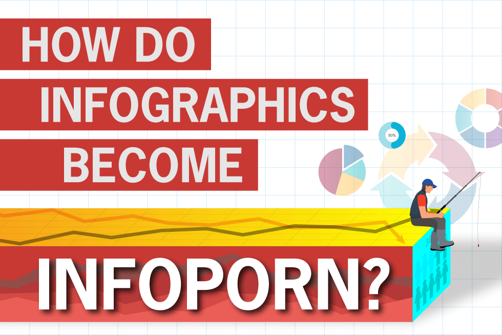
RRx: A guy with a fishing pole with the sun in the background?
Siry: Exactly. And it gets to the point where you don’t even know what you’re looking at because it’s like a bar chart that’s carved out of a suitcase to talk about travel or something. And it’s like, why — why are these simple things presented like this? I find it more confusing than it is illuminating.
So I guess those were earliest modern-era examples of what could be called infoporn.
But as far as the use of the actual term, I’m pretty sure I’d never heard the phrase “infoporn” before it was presented to me at Wired. So I’ll give them credit with acquainting me with the term if not the actual concept.

The launch of USA Today in 1982 brought fun, cheeky infographics that prioritized accessibility over readability to the national stage.
RRx: You were heavily involved with infographics at Wired and then also with design and infographics at Rolling Stone. In those days, how did you approach infoporn and more traditional infographics?
Siry: Something I want to make clear is that “Infoporn” was a discrete section within Wired. It was like a one-page or two-page section, or sometimes even a gatefold, where we strove for more of an infoporn style. It was within the confines of the infoporn section where we let the freak flag fly!
But wherever we had the need for regular run-of-book charts or tables accompanying articles, they were presented in a much more straightforward way.
When you needed a little quarter-page chart to support some article, you didn’t necessarily want to make it crazy or loopy. We, and Wired as a whole, would stick to straightforward infographic presentations in those cases.
RRx: How do you know when to visually get “freaky” or be serious?
Siry: The determination is 100% about your audience and your topic.
If your audience is radiologists who want to know the results of a new contrast agent, then you’re going to present it in a very straightforward, a very Tufte-esque way.
If you’re presenting a PowerPoint to a group of executives in a conference room, then you’re going to want to jazz it up a little just to prevent their eyes from glazing over!
RRx: What about PowerPoint infographics then — Tufte thought that this software tool mediocritized design. What do you think?
Siry: PowerPoint provided easy-to-use data visualization tools to everyone — the idea being that as long as you can fill out a spreadsheet, you can click the “make this a chart” button and PowerPoint will do the rest. But putting PowerPoint’s many options to add visual flair (some more ill-conceived than others) in the hands of people without experience in data visualization resulted in an explosion of chartjunk.
A little goes a long way when embellishing a chart, and you can go too far very quickly when you introduce a 3-D chart button. It’s much easier to compare the height of a flat bar to the straight line representing a value than if the bar is now a three-dimensional rectangular prism, one that’s standing some distance away from the backdrop on which all the y-axis value lines are now represented. But if you then use PowerPoint’s option to layer three rows of 3-D bars to represent three series of data, and add two-point perspective, you’ve gone off the rails and have a chart in which no bar’s height can be compared to any other’s.

Microsoft PowerPoint pioneered the ability to make data completely unreadable with a single click.
I’ve committed the same design-crimes in pursuit of infoporn. I combined multiple charts in one article at Wired where the writer was discussing the pounds of rocket fuel needed to launch satellites and, in another article, where the writer was predicting, like a fortune teller, different aspects of the information boom. In those cases, skewing a chart across a solar panel or having it wrap around a crystal ball was directly interfering with the ability to compare lengths or positions of bars and lines. A fun illustration overriding readability is a hallmark of infoporn.

The dizzying possibilities of the early days of tech called for a similarly giddy style of infographics. Created for Wired by Eric Siry.
RRx: What about visual overload, when graphic designers use troves of data represented by very dense graphics, like a scatter plot — they can be super accurate but aren’t they hard to understand?
Siry: There are designers who do take infographics as a jumping off point for making something that’s visually striking and yet extremely data dense — having a lot of points of information that are not necessarily presented in the clearest way. These infographics are too respectful to the data to be considered infoporn but, if too much data is crammed in, it can interfere with conveying a specific point or story.

Two visually striking graphics from a Wired UK edition of Infoporn that show the uneven split between men’s dialogue and women’s dialogue in movies. The one on the left is very information dense, incorporating additional data such as movie title, year of release, and box office gross, but it takes effort to interpret. The one on the right is much more focused and simple, and it tells the story at a glance.
RRx: Now moving over to medical communications—whether we’re talking about brand marketers or agencies—as the creative director at REALITYRx what do you keep in mind in terms of context and target audience?
Siry: Especially in biotech and pharma, where the topics and the indications are often quite serious, you obviously don’t want to make a fun, lighthearted graphic about conditions or diseases.
If you’re doing something for a sales rep, you don’t have to necessarily pull out all the stops to catch their eye. Why? Because it’s part of their job to look at this information and use it when they’re trying to persuade customers to make a purchase or decision of some kind.
Then, again, if you’re going to do something that’s customer-facing, like a core sales aid or an email, then you do want to make it more engaging while still keeping it clear and concise.
Working in biotech/pharma, I’ve never seen any occasion that would justify the use of infoporn, per se, although we have had the opportunity to do many very colorful and interesting presentations of data.
For example, we did a brochure with Integra LifeSciences for the Codman CERTAS™ Plus Programmable Valve, which is an implantable device that provides constant intraventricular pressure and drainage of cerebrospinal fluid (CSF) for the management of hydrocephalus.
The challenge was to illustrate the device’s resistance to electro-magnetic interference from various devices, including iPhones, magnetic purse clasps, 3T MRI scanners, magnetic toys, cochlear implants, wireless chargers, and more. We were able to integrate insets of various magnet devices in a way that enhanced comprehension of the data rather than decreasing it. We had a little fun with it because it lent itself to a very visual treatment.

A sales brochure touting the performance of a medical device calls for a straightforward presentation of data, but it can be livened up with color and graphic elements without impacting readability. Created for Integra LifeSciences by Eric Siry.
RRx: We covered a lot of good ground; is there anything you would like to add?
Siry: I want to emphasize that in the early days of Wired covering the tech boom, infoporn was often the right choice for that specific audience, for that specific purpose, and at that specific point in time. It’s always just about figuring out what’s the right way to present the visual for your purposes, but none of them are inherently bad. Designers, publications, and agencies have many different options for getting across information in what they believe to be an interesting and effective way. Just know your audience and know what you’re doing when you’re breaking Tufte’s rules.
